-
Architects: Linazasoro Arquitectura
- Area: 10000 m²
- Year: 2008
-
Manufacturers: Parklex Prodema

Text description provided by the architects. The project is part of an arrangement that occupies half a city block, along with two more buildings. It is located on the former grounds of Altos Hornos de Vizcaya that disappeared in the 80s. Later RIA 2000 proceeded to urbanize these lands that have shaped the Lasesarre area.
In 2000, RIA 2000 convened a Restricted Competition for the city block in question, which was divided into three sectors. Our project was the winner of one of them.

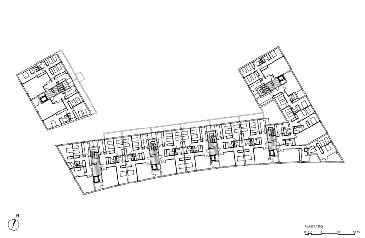
The regulations were modified to suit the winning project proposal. The height of the ground floor was lowered, chamfers were abolished and a curved facade was designed. All of this was intended to enrich the existent urban planning which was considered excessively conventional. In this way, new spaces were generated different from the conventional streets of parallel facades, which yielded a larger sidewalk surface. The sidewalk penetrates through the building joining the courtyard at the center of the city block, planned as a public square.

The facade of the building is composed of horizontal bands with continuous lines of openings in which windows and terraces alternate. This reinforces the curvature and the unity of the facade, giving it a proper urban scale. It is crowned by an attic whose terraces are interrupted by metal clad volumes imposing a rhythm in the building, otherwise excessively horizontal.
The plan is more conventional with two apartments per floor. Those on the top floor have large terraces, especially the ones on the sharp corner of the building.

Regarding the structure, we sought to make it correspond with the horizontal and heavy character of the building. It is reinforced concrete with V-shaped columns on the ground floor to reduce their amount and at the same time, make more expressive the weight of the building on them.
Given the nature of the project, in which we sought the contrast between weight and lightness, the former marked by horizontality and the building’s relationship with the ground floor columns, and the latter by the continuous lines of openings, we sought materials consistent with these effects, helping to strengthen them. We therefore proposed different alternatives always based on materiality. We considered a first option in prefab concrete, discarded to avoid an excessive uniformity, because we were looking for a dark and at the same time shiny color, incompatible with the existing products on the market.

Looking for a ventilated ceramic facade, we contacted ceramics specialist Toni Cumella, who offered the possibility of making different types of pieces that combined offered a set of textures, which was considered very adequate to the variability and toning that we initially sought. The pieces were matte and shiny, always colored dark gray, the matte piece placed alternatively in reverse to enhance the texture.

The facade was completed with dark wood joinery and “Prodema” panels for the blinds. These are slightly highlighted with respect to the woodwork, generating a horizontal line.


